My birthday challenge – “if I gift you a set of nine 30cm square frames will you find or make some prints for them and then we’ll put them up in the lounge?” – “in black and white”.
Couldn’t resist, I love black and white work! In the digital realm it is so easy to shoot everything in colour and to shoot so much of it. In my old film days you would select a B+W or Colour film to load before you shot anything. While that locked you in to one type of result it was of itself no guarantee that what was shot suited either B+W or Colour! The creative selection and visualisation still had to happen.
When I looked in to my Lightroom Catalog and saw a sea of colour images taken over the last 10 years with a variety of cameras (including phones) and even more scanned in from negative and transparency film I was excited by the challenge of selecting images that would (? may) look good in B+W. In anticipating the post-processing work needed I looked forward to learning the technical aspects of doing ‘conversions’, but also accepted that a number of images may not be that crash hot in B+W. Equally, the “square” part of the challenge, à la Instagram, meant that a lot of shot work had not been composed for squareness.
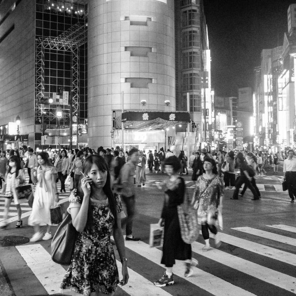
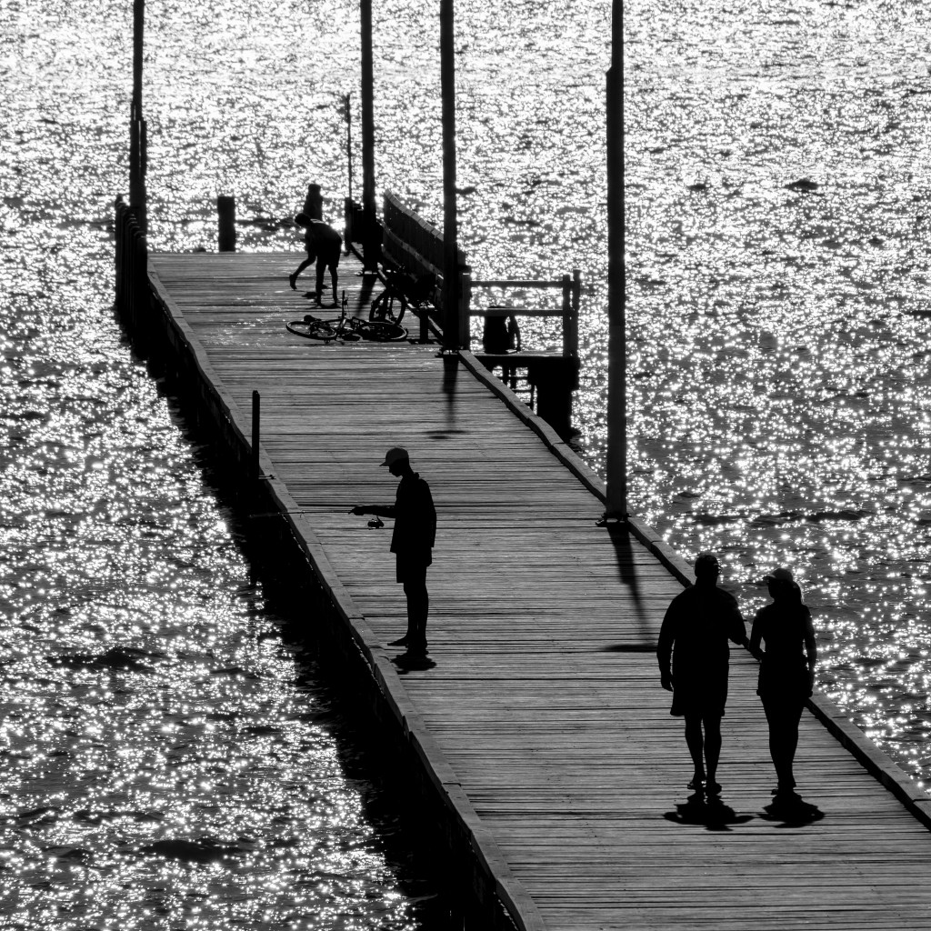
The featured image above was shot on a Panasonic FT10 – waterproof, pocket size, compact – back in September 2013. Handheld, night-time shot taken while I was walking around one evening after a conference day. Shot in colour using available light at the famous Shibuya crossing in Tokyo, Japan in tourist mode. I’ve always liked the 4:3 colour original – what makes it for me is the pedestrian on the phone backed by other crossers with some motion blurring. The buildings surrounding the crossing have facades covered in all manner of flourescent lighting and panels providing an even(ish) level of brightness across the intersection.

Ok, let’s deal with the obvious. Snapshot, not particularly sharp, rushed as I was crossing myself, lucked out with a good foreground person. So, better/same/worse in B+W and squared off? Would either the colour or B+W print make a stand-alone picture? Does the B+W version fit with the challenge of a ‘set of 9’? If it’s in a set does it have to be individually perfect?
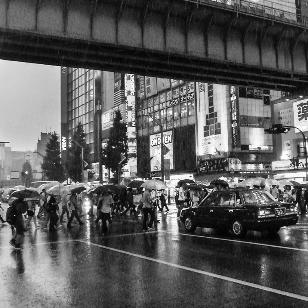
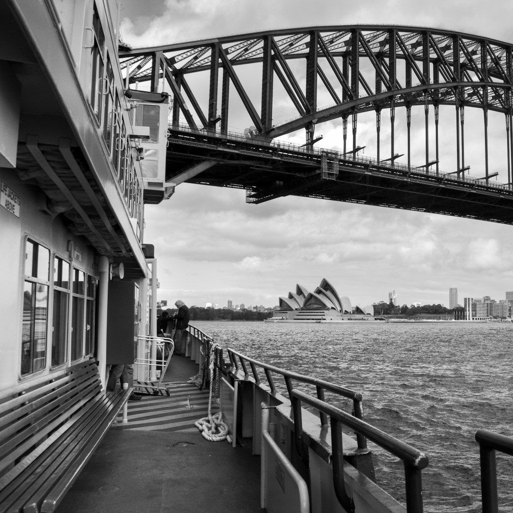
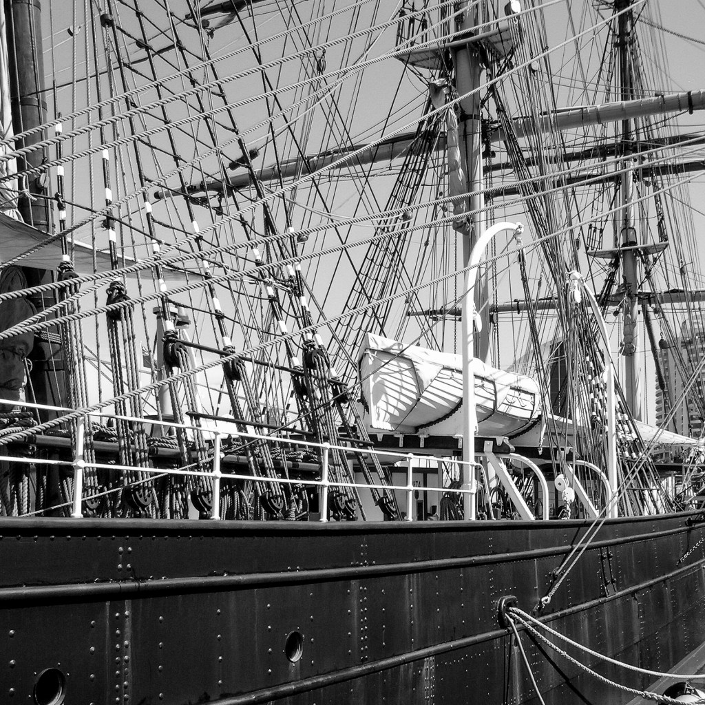
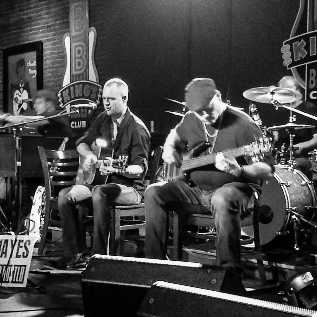
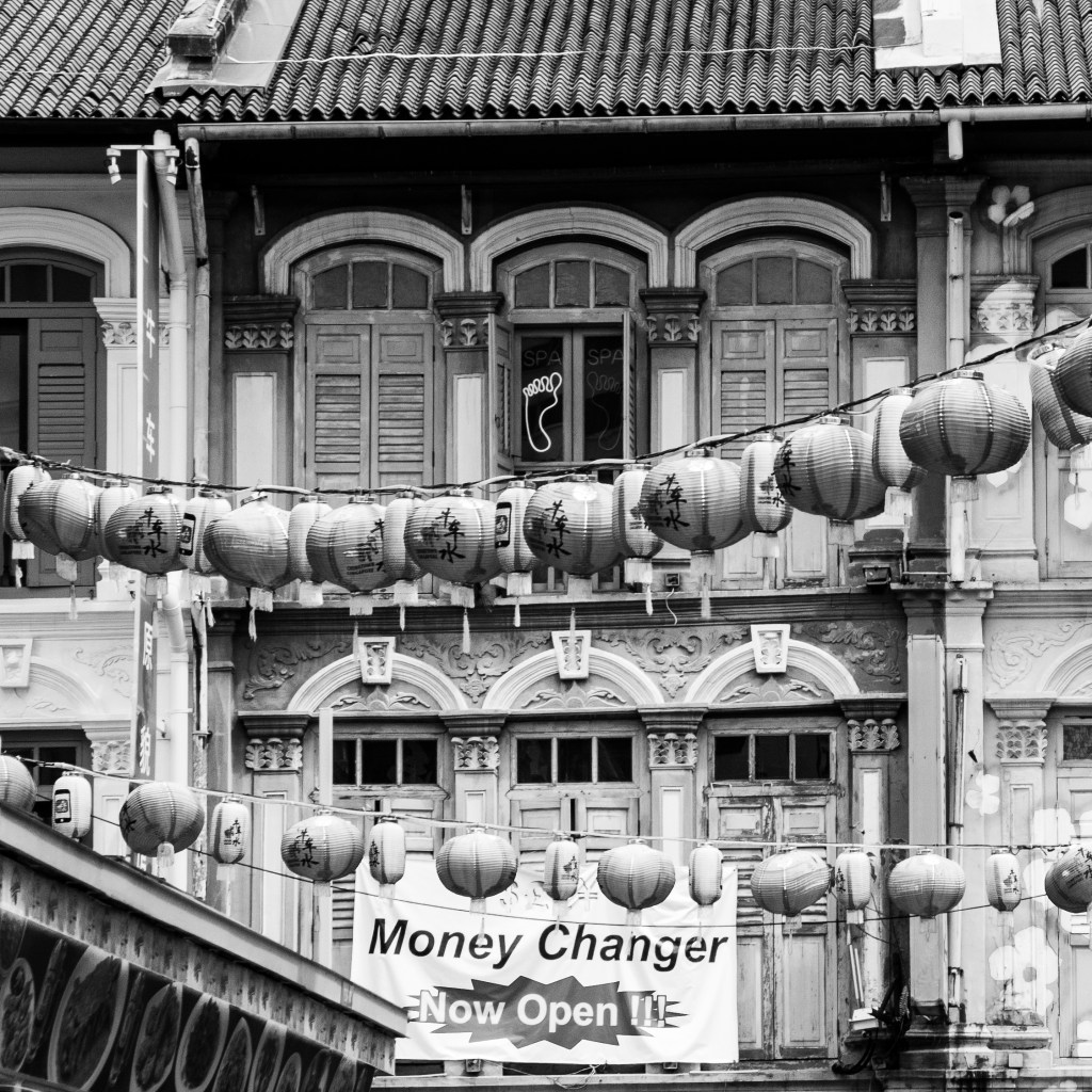
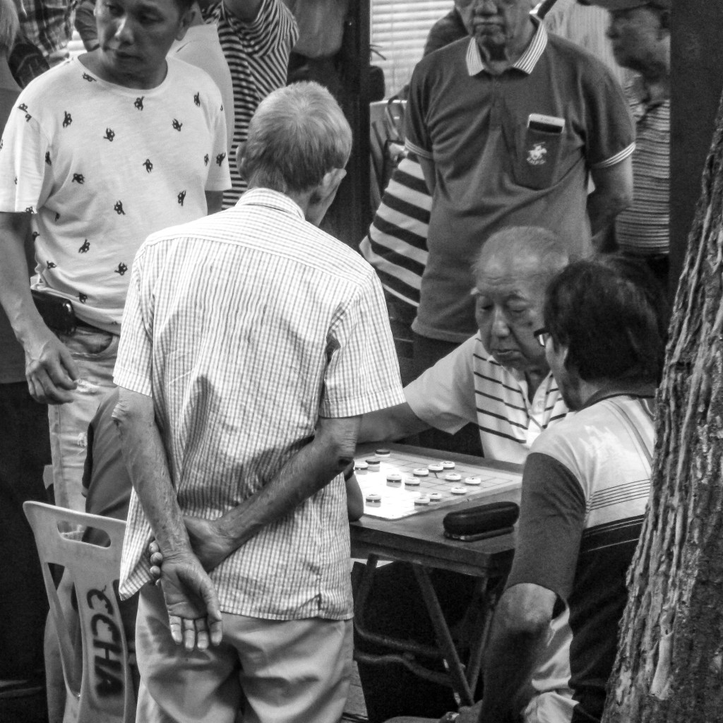
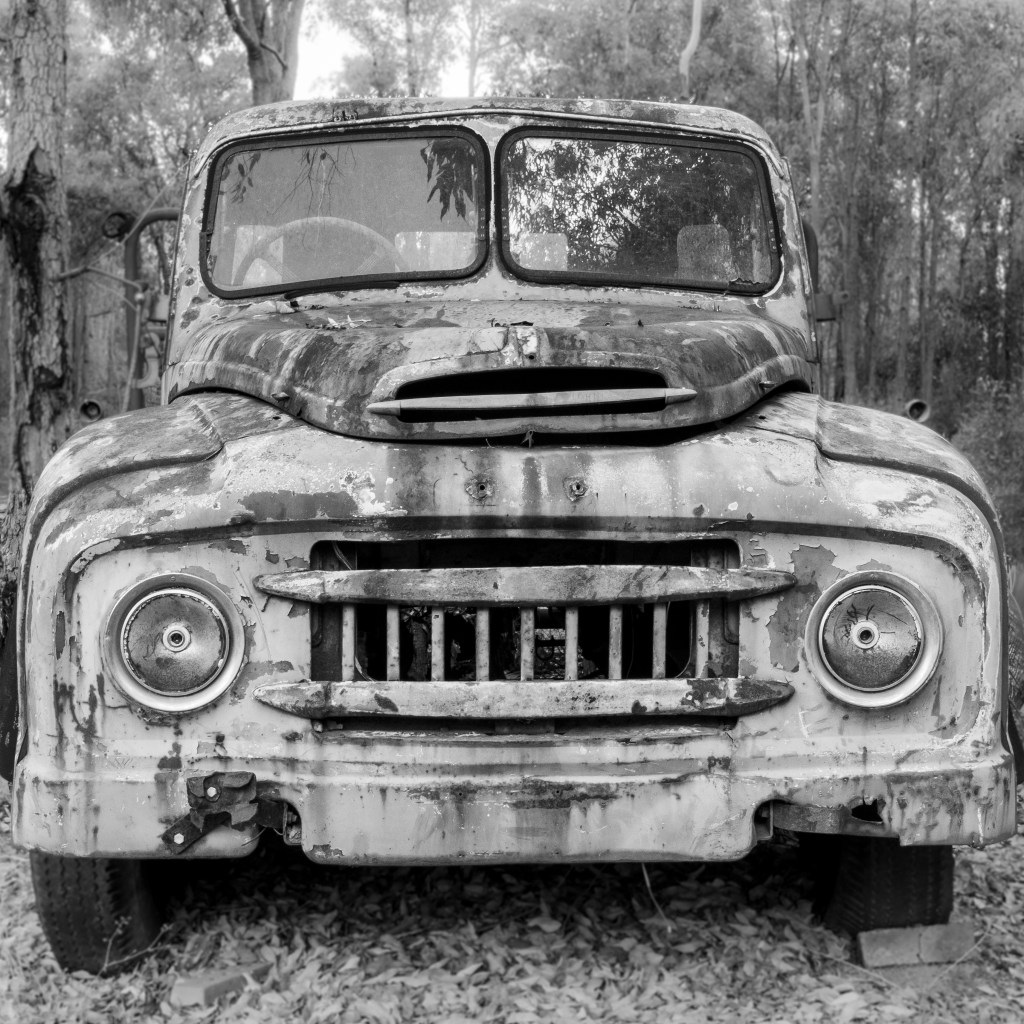
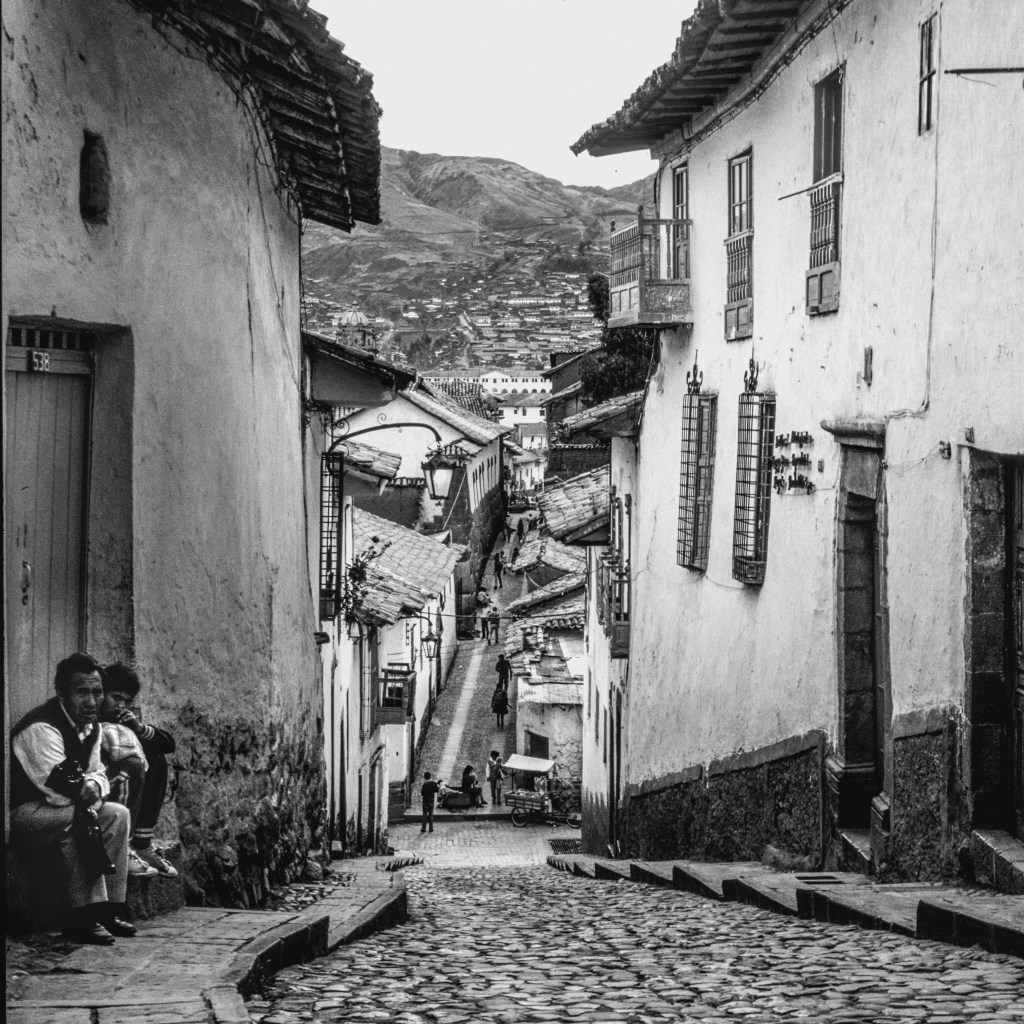
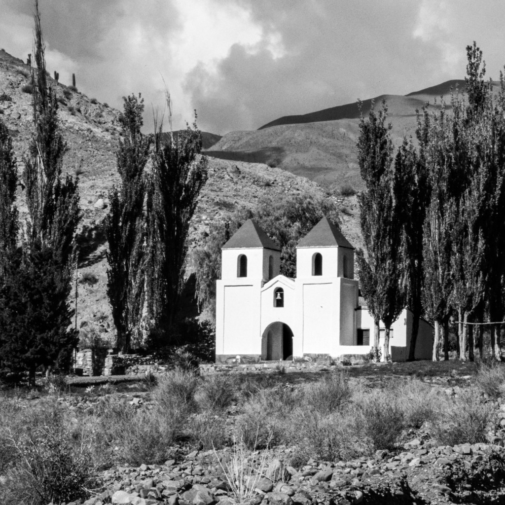
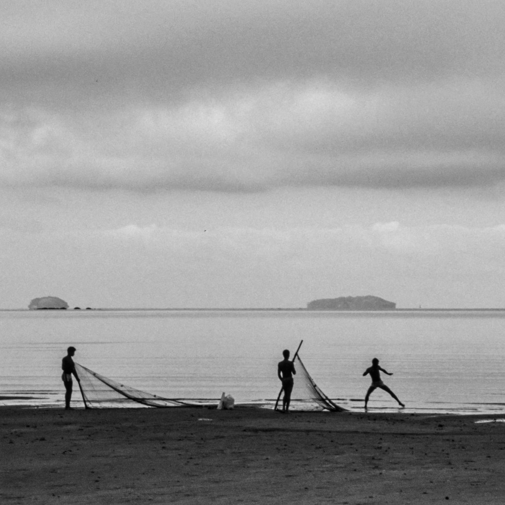
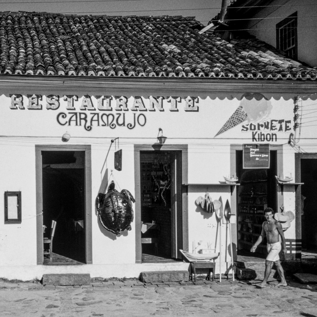
That’s my challenge now whilst I wait for the nine 30cm square frames to arrive (did I mention they are black edged?). Some of the other candidate shots I started picking out – I’m thinking of getting to a set of 20 to make a final selection based on how they look together as a set (but not a theme) – include 30+ year old scanned Kodachrome slides, brand new shots from my recent Fujifilm XT30 with excellent XF series lenses, and a range of other equipment in between. So here are some candidates I’ve played around with so far.


I’ll add a few more candidates and then exercise my brain and heart in both adjusting & finessing the images, and making a selection for printmaking and framing.
In my next post I’ll explore my experience of adjustment and finessing – after all they will need to have some style or look to be displayed as a set.

Leave a comment