In my last post I accepted a challenge to find nine photos that would look good in a square format in B+W. These photos would be framed in nine 30cm square black edged picture frames and hung on the lounge wall. I wasn’t looking for a ‘theme’ but my selection should look interesting and sit well together.
I made life hard for myself by picking a photo that needs work before I can consider its inclusion (or not). The photo I’ll focus on is:
- scanned from a 35mm Agfa CT100 transparency
- originally shot on a Canon AE1 with a Canon 35-105mm zoom
- old – taken in January 1989!
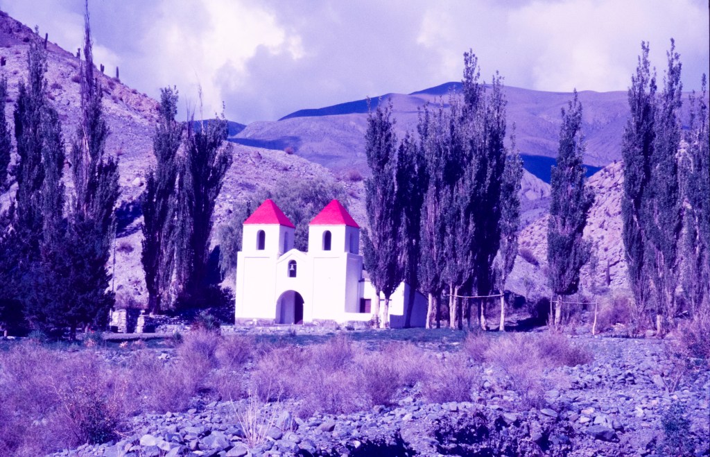
- of a small chapel in northern Argentina (east side of the Andes)
Why would I make it so hard? I have thousands of other photos in the digital world stuffed full of metadata – ISO, f-stop, focal length used, shutter speed, etc. But this photo feels worthy of consideration.
So, of the 3 types of transparency film I shot in South America – Kodachrome, FujiChrome DX, & Agfa CT100 – the Agfa had faded the most when I scanned the slides from this trip (December 1988 to February 1989). Kodachrome is what I took with me, Agfa is what I bought in Peru, and FujiChrome is what I sourced in Bolivia. Certainly was fun carrying more than 30 film cassettes in a back pack, topping up supplies with what was available. I couldn’t get Kodachrome in South America at that time which was my preferred stock when setting out from Australia.
I dread to think how many shots I would have taken with digital gear instead of scarce film – probably in the 10s of thousands!
The chapel as scanned (can’t honestly say ‘as shot’).
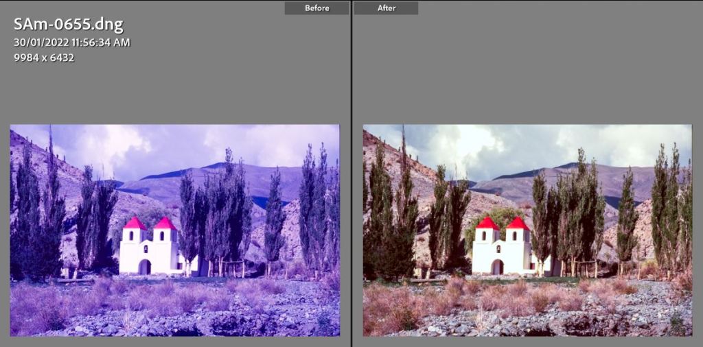
If I was just sticking to correcting my scans then I could take one of two roads – stay in Lightroom, in the Develop module and make adjustments in the Basic and Tone Curve boxes. Here the most effective changes are Temp to the right, Tint to the left, and in Tone Curve:
- Blue Channel: flatten left side to Input 68 Output 2, shift right side to the left Input 227 Output 255
- Green Channel: shift right side to the left Input 245 Ouput 255
- Red Channel: shift right side to the left Input 239 Output 249
Is that better? Well, conundrum time – are the colours truer OR how do I remember the scene? I suspect after all the years there is an element of how I would have liked the scene to look. Equally, I am not an expert – this is learning by doing.
Lightroom
Basic & Tone Curve
The other path was to do the work in Photoshop where the use of adjustment layers adds both options and complexity. Here I used a Curves Adustment Layer and made changes to the red, green and blue channels in a similar way to Lightroom – but, I have to say in some ways it was easier to do in the more ‘complex’ product. Or at least that is how it felt.

Photoshop
Curves Adjustment Layer

The adjustment that made the biggest improvement was to slide the Blue Channel left anchor from 0 up to 135 (see the dark fill triangle circled in red). The right anchor is shifted in to the left to eliminate the sharp peak at the far right (light filled triangle is brought in to 246 from its default of 255). The middle value is left at 1.
The same right end adjustment was made in the Red and Green channels – bringing in the anchor to eliminate the sharp peaks.
The two results are different – but in principle both paths have improved the picture. Final adjustments to either now sit more in the subjective (how bright or colourful was the actual scene all that time ago?) and the white balance (using a grey point).
The Agfa film had certainly faded the most of all the films I used on that trip and the overall colour cast clearly indicates each dye layer fading at different rates. But, I am happy that something more pleasing is possible.
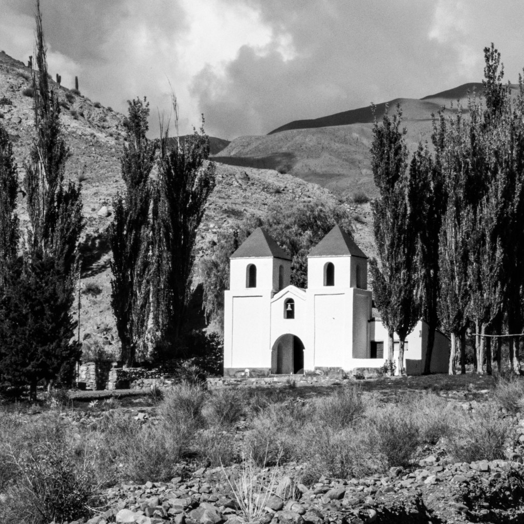
In playing around with this picture I felt there was potential in the B+W space so it became a candidate for the 3 x 3 challenge. For my next post I will tackle the transition to B+W and what is for me very important – that in looking at the final set of 9 prints on the wall I wanted each photo to have rich blacks through to whites and a strong contrast/punchy look.
In following through on the colour fading/restoration matter there is one video post I can highly recommend on using the Photoshop Curves Adjustment Layer in correcting casts and dye fading:
Enjoy the video!

Leave a comment