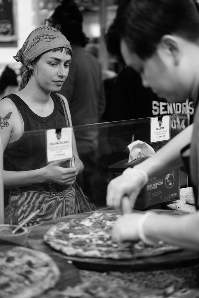
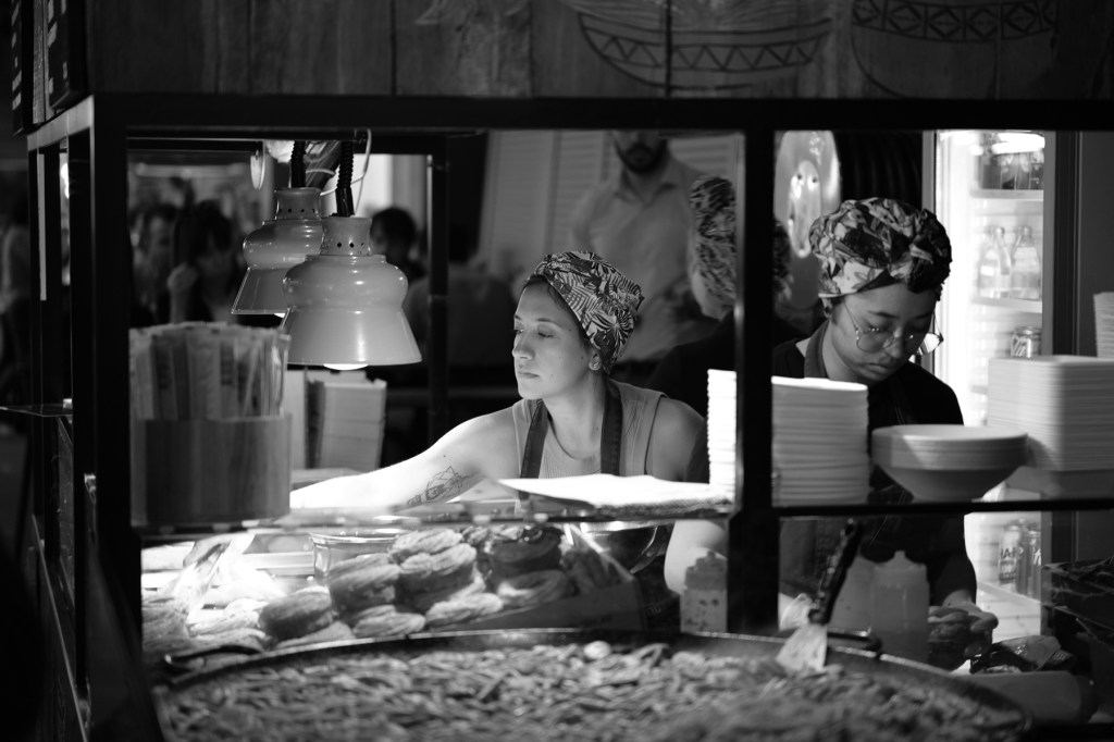
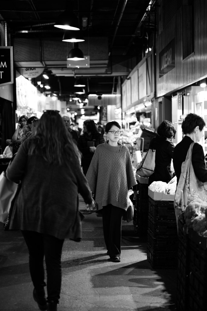
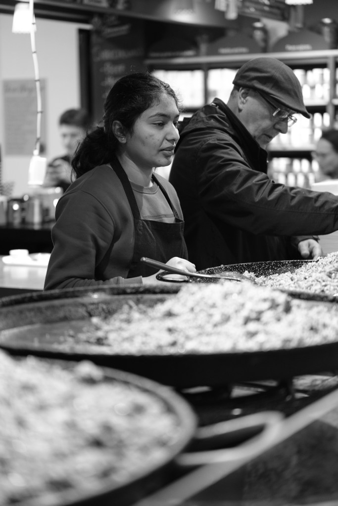
Several times a year I travel to Adelaide for a Board meeting for a not-for-profit organisation that I set up with 4 colleagues back in 2013. Quite often I have some free time between the meeting and my flight home so I take a camera and one lens only, and then to wander the markets or some other area of Adelaide.
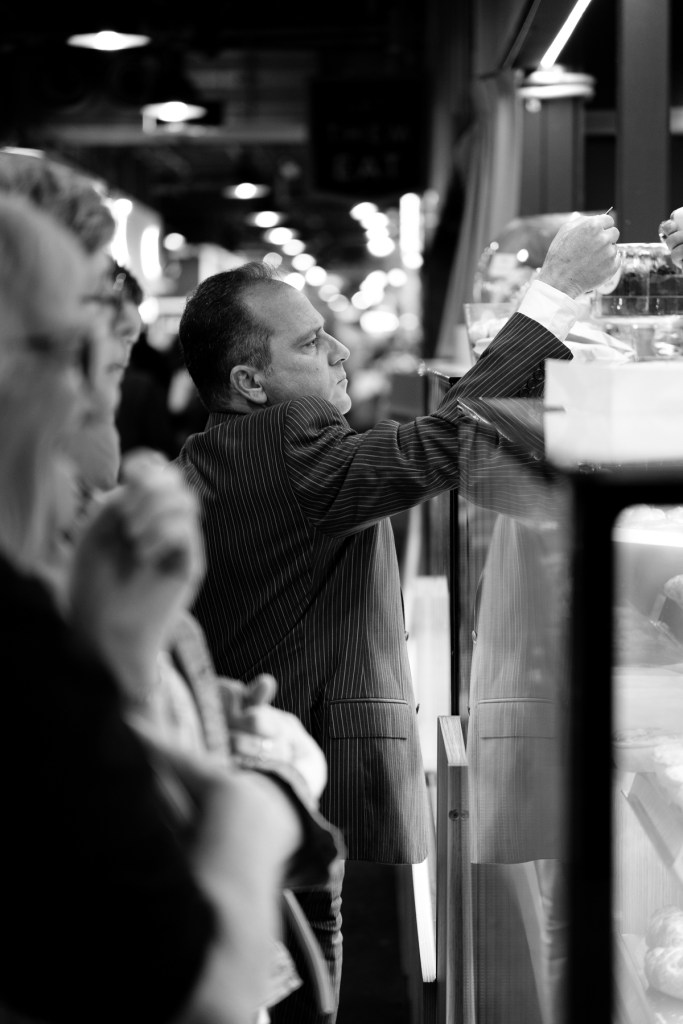
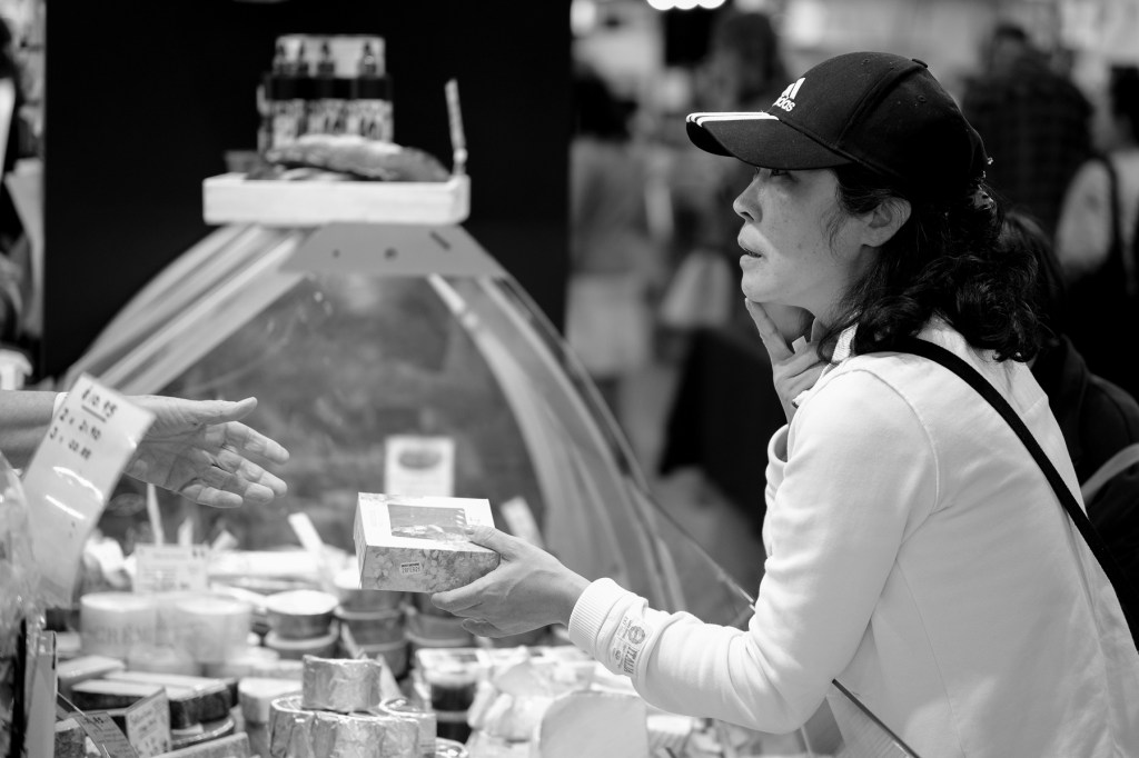
On this trip I took my newly acquired Viltrox 56mm f1.7 AF lens to see how it performed wide open in an indoor enviroment. I am liking the lens – nice and sharp, lovely background (bokeh), and easy to handle being small and light.
Finishing off my 3×3 photo challenge seemed straight forward once I had narrowed my choices down, cropped to the square format, converted to B+W, and done some basic adjustments to give them a bit of punch and contrast. They had to look good as a set – “a look” – and I thought I had that.
I am a bit conservative, so I thought I’ll pick 3 images and get them printed to see how they would look on a lustre paper from the lab where I would get the whole set done for framing. Picked them up and my heart sank – can you guess?
They were dark and, well, dark. No life in them and certainly not what I thought I had achieved in selection and editing. Sitting in front of my sceen I was happy and on track. But on paper, no, these will not grace the lounge wall for all to see.
I had fallen into the classic beginner’s trap of calibrating my screens for colour but having them (slightly?) on the bright side. They were my screens for work and document production so I had them set to a comfortable level for THAT type of work. So, what does that mean? My images looked bright and punchy on the screen but printed flat and darker. I hadn’t therefore begun my editing with the end product in mind – a print. And, as I’d given all 9 prints the same “look” they would have all printed dark.
Time for some homework – and a bit of YouTubing of photographers I follow and learn so much from. I came across one clip that explained the heart of my issue in clear and understandable terms. I had overlooked the facts that screens emit light and that prints reflect light! They would never be equivalent. There was a clear lesson in this clip and that was you had to play, learn, experiment, and try things out. Which is what I had done in being conservative and doing some test prints (investing $s in the final result).
What I had to do was adjust my monitor brightness’s down in steps, then at each step re-evaluate my images and adjust their punch and lightness up (brighter/lighter) until I got to the magic place of having what I see on the screen approximate the look I was after on the print! And then seeing the print come out in the way I liked. The screen and the print will never be identical (and I knew that which is why I wanted to use one lab and one type of paper throughout), but I had to be happy with the printed result moreso than the lovely image I saw on the screen.
The originally printed image which I liked on the screen – and which fitted in with the other 8 images for tonal range. But … when printed looked too dark to hang on the wall as a print.
The “lightened” image – i.e. lightened on a screen for which brightness had been lowered to be a better match for printing. When reprinted (same lab as first print) looked better on the wall. Then the other 8 images had to go through the same lightening process so the set retained its look.
Compared to the image above it may be hard to see much difference, but that is the point – how much lighter did the print need to be to look good on the wall (and not on the screen)?
I found this YouTube clip to be really useful in getting my thoughts together and knowing how to finish this 3×3 project to a good degree of satisfaction.
“Better photo prints – Best screen settings for prints/editing” by Keith Cooper.
I would highly recommend watching this clip by Keith Cooper. An excellent explanation in clear language with no BS. And he isn’t selling you anything, just being free and open with his knowledge and experience.
Learnt something, reminded myself of things I kinda knew, and now onto the next challenge.
In my last post I accepted a challenge to find nine photos that would look good in a square format in B+W. These photos would be framed in nine 30cm square black edged picture frames and hung on the lounge wall. I wasn’t looking for a ‘theme’ but my selection should look interesting and sit well together.
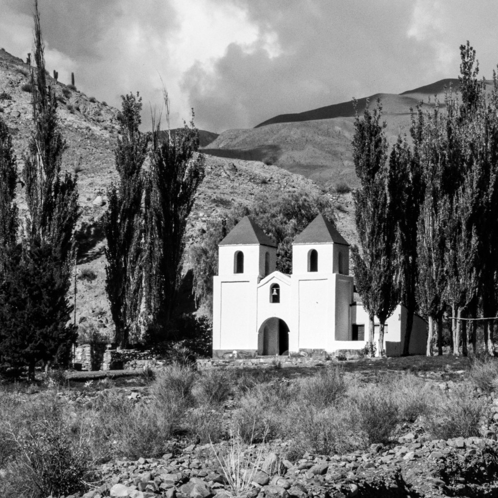
I made life hard for myself by picking a photo that needs work before I can consider its inclusion (or not). The photo I’ll focus on is:
scanned from a 35mm Agfa CT100 transparency
originally shot on a Canon AE1 with a Canon 35-105mm zoom
old – taken in January 1989!
of a small chapel in northern Argentina (east side of the Andes)
Why would I make it so hard? I have thousands of other photos in the digital world stuffed full of metadata – ISO, f-stop, focal length used, shutter speed, etc. But this photo feels worthy of consideration.
My birthday challenge – “if I gift you a set of nine 30cm square frames will you find or make some prints for them and then we’ll put them up in the lounge?” – “in black and white”.
Couldn’t resist, I love black and white work! In the digital realm it is so easy to shoot everything in colour and to shoot so much of it. In my old film days you would select a B+W or Colour film to load before you shot anything. While that locked you in to one type of result it was of itself no guarantee that what was shot suited either B+W or Colour! The creative selection and visualisation still had to happen.
When I looked in to my Lightroom Catalog and saw a sea of colour images taken over the last 10 years with a variety of cameras (including phones) and even more scanned in from negative and transparency film I was excited by the challenge of selecting images that would (? may) look good in B+W. In anticipating the post-processing work needed I looked forward to learning the technical aspects of doing ‘conversions’, but also accepted that a number of images may not be that crash hot in B+W. Equally, the “square” part of the challenge, à la Instagram, meant that a lot of shot work had not been composed for squareness.